Application Reviews Made Quick, Easy + Intuitive
Insight
While I was building the first step of the application-based program experience for our customers — the Submission Portal — I had to account for the second half of the experience in the form of a Review Portal. This platform took the data that applicants submitted within the Submission Portal for a scholarship or grant and then displayed it in a secondary portal review and targeted feedback.
Challenge
One of the most apparent obstacles to building a Review Portal from scratch was that it was a massive project but still needed to be conceptualized and developed simultaneously with our Submission Portal, since both shared data. Trying to create a robust experience that was also easy to navigate and handled a large volume of potential submission — all under a restrictive time frame — seemed like a daunting task.
A Different User
Unlike the Submission Portal, the Review Portal users were usually members of the organization that was running the program applicants were applying to — grant, scholarship, fellowship, award. We began our research interviewing members of these organizations in groups, and found collectively the biggest hurdle was that most of the reviewers were not technically savvy. Most reviewers were older in age range, unlike most applicants. A good portion of them came from non-profit and government sectors and generally did most reviewing manually with pen and paper. Presenting them with a digital interface to address their reviews needed to be simplified, but without being dumbed down. Through empathy mapping, I gathered pain points and concerns around this shift, and recorded reviewer flows from constituents to get a clear understanding of their processes and how we could streamline them for simplicity. We established a clear set of personas that accounted for the majority of reviewer use cases (and even most of the edge cases).


Whiteboarding, Wireframing + Feedback
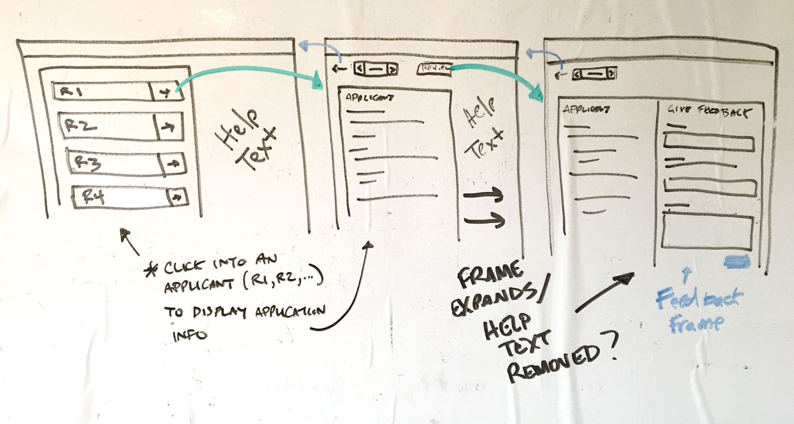
Similar to the Submission Portal, we spent a significant amount of time sketching out concepts for the Review Portal in whiteboard brainstorming sessions. The next step was wireframing these sketches into potential UI that we could present to stakeholders, and eventually, our customer advisory board for evaluation.
I connected with some targeted portal customers and was able to present our wires and simple interaction prototypes to some of their actual reviewers. Most of their responses were positive, yet we noted a few friction points:
Most reviewers wanted to view the submission at the same time they provided feedback, especially if they were lengthy or had multiple sections/attachments. This way, they could compare content without having to jump back and forth, keeping focus.
Navigation between reviews was critical in instances where a reviewer was assigned a large volume of applications. Reviewers needed to quickly move from one application to the next with as little resistance as possible.
Customer administrators wanted a more natural way to handle the customize the form display in the configurations. Having this control would make setup and portal appearance easy to maintain.


Solutions
I went back to the drawing board with the overall application UI and brainstormed on a method to account for a feedback panel to display simultaneously with the application they were reviewing. The first option was opening the feedback pane on top or bottom of the application information, but this was suboptimal since it would require extensive scrolling, especially if either pane were lengthy — an option that wouldn't solve the first pain point since it was introducing a similar paradigm. The better was reducing the width of the application pane to allow for an equally-wide feedback pane displayed in parallel. In our research session, we discovered that the majority of reviewers would access the portal on desktop — smaller form factors usually weren't preferred, unlike with the Submission Portal. Because of this factor, we could leverage the broader width of a desktop form factor to maximize the screen real estate for side-by-side UI.
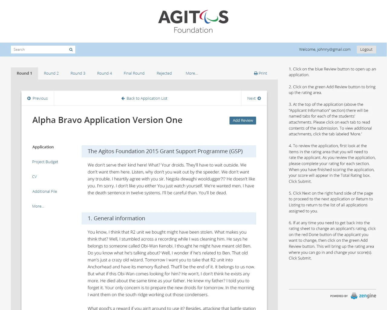
I designed a simple navigation solution that employed a pagination-like pattern in a persistent directional button set at the top of the screen. Reviewers could then quickly flip through applications without having to dive back to the homepage — this was key for use cases where reviewers had to engage with a large number of requests. Keeping them within the reviewing/feedback screens was vital.
To address the form display, I created a new data detail tab in the portal settings where administrators could easily drag + drop available data to build a form screen tailored to their needs. With the addition of visual cue of their form hierarchy, administrators would have a clean, clear visible structure of how the data builds out their portal, with the ability to re-order or remove sections with ease.
I presented these new UI options to the same feedback group, and they all agreed they significantly improved their experiences, provided them with greater confidence, and solved the challenges they had been facing.


High Fidelity Designs
After refining the review portal UI from the customer feedback sessions feedback, we presented high-fidelity designs to the stakeholders and developed the approved portal. Using Submissions Portals as a model, we opted for a limited beta release of the newly developed Review Portal to a few of our most collaborative customers who had been requesting a portal solution. We uncovered a few more minor bugs and experience hiccups, but they were quickly ironed out.
Iterations
I continue to iterate on the Review Portal since its release in 2016, adding new feature requests such as Single Sign-On capability, bulk PDF creation of applications for offline review, custom field displays, and improved pagination and printing.

